I develop clean and memorable brand identities that translate the client values into effective visual communication. This can be a simple logo design to full brand guidelines. My expertise spans from the trusted healthcare sector to the competitive consumer space, successfully serving established enterprises, dynamic new ventures, and everything in between.
LOGOS


branding
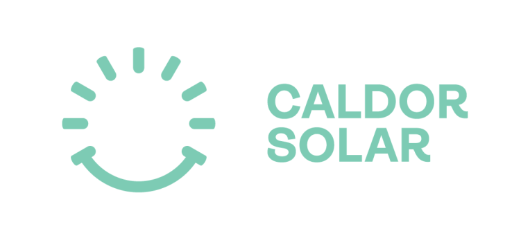
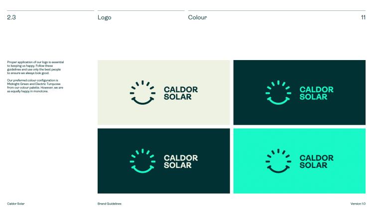
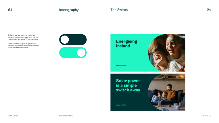
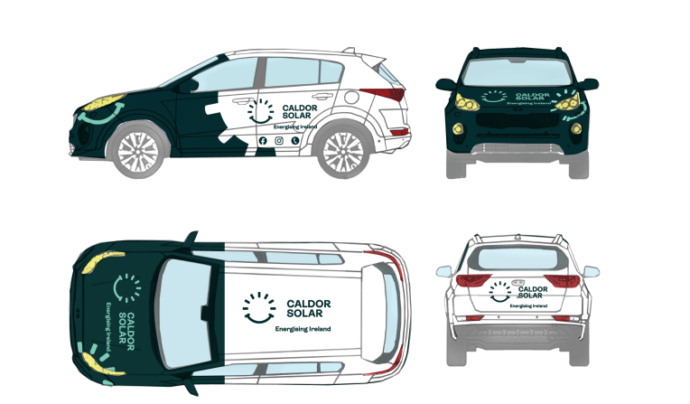
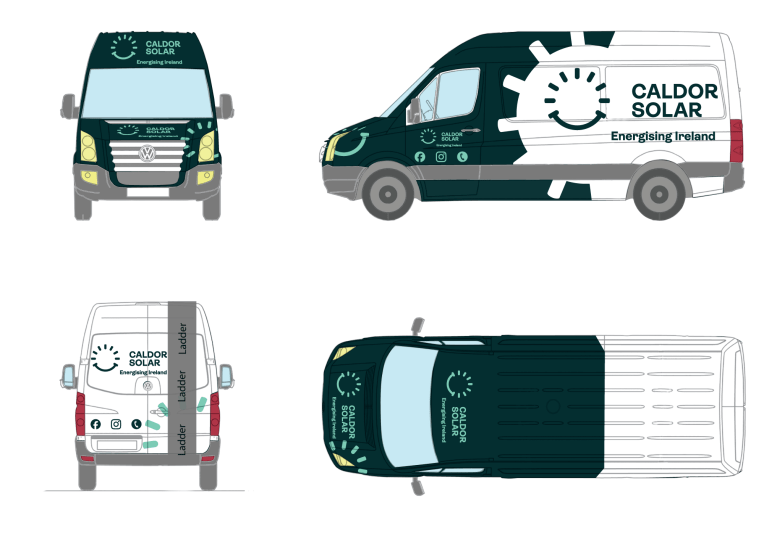
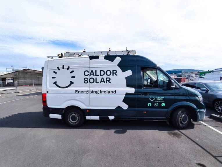
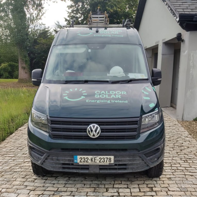
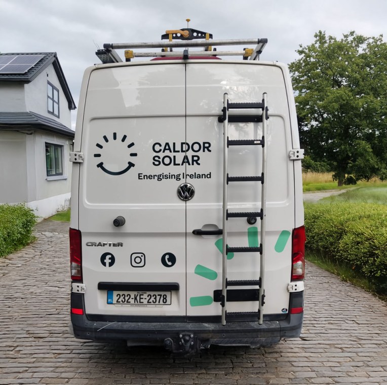
Caldor Solar
Despite its market position, Caldor Solar’s outdated branding failed to convey its industry leadership. We delivered a complete modern identity—from logo to website (https://caldorsolar.ie/)—that re-established them as a vibrant, authoritative force. The strategic use of a bold, optimistic palette and clean typography visually communicated innovation and reliability. This cohesive rebrand dramatically increased awareness, firmly repositioning Caldor Solar as a leader in the Irish market.


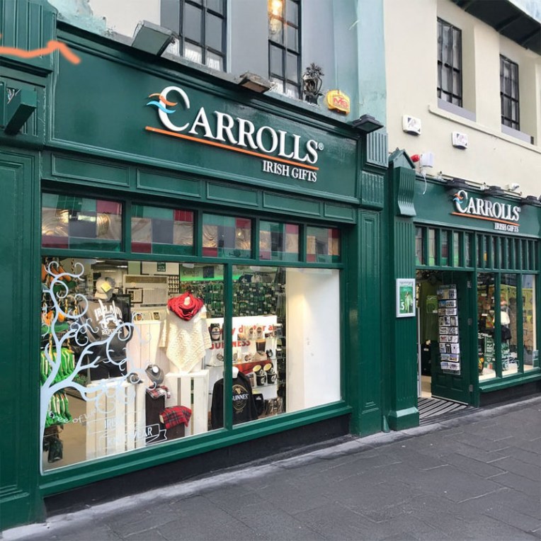
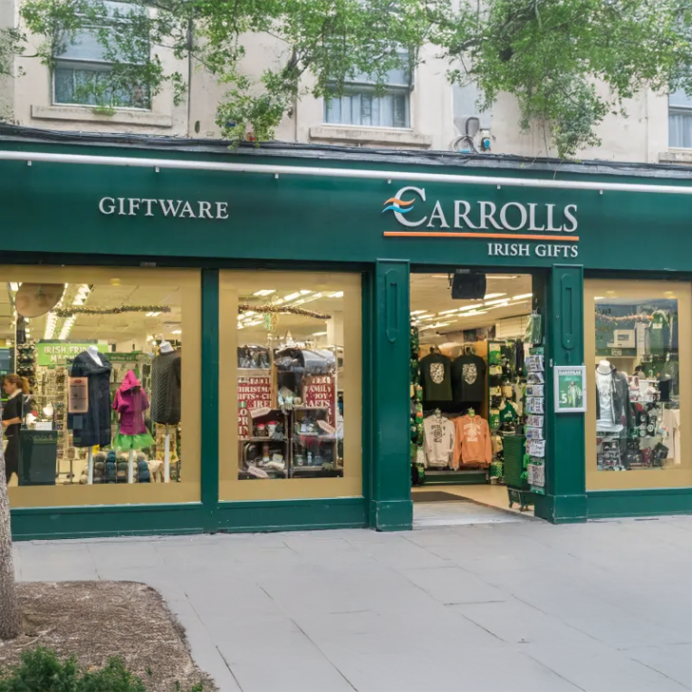
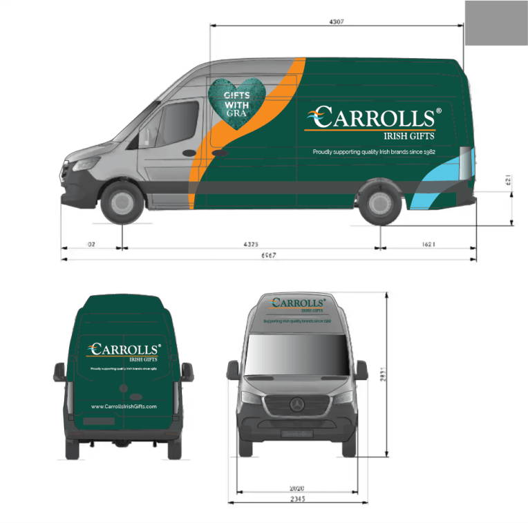
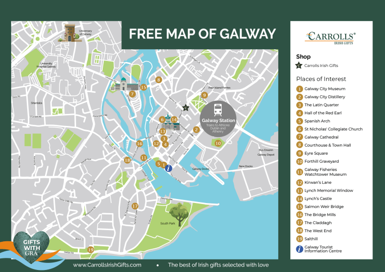
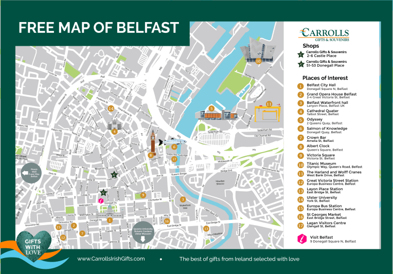
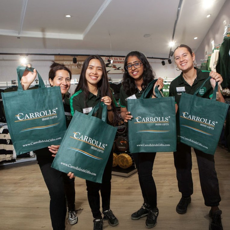
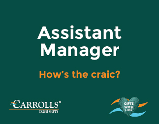
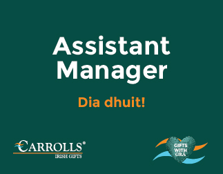
Carrolls Irish Gifts
To elevate Carrolls Irish Gifts to the premier destination for Irish gifting, we created a modern, cohesive brand reflective of its unique market position. This new identity was meticulously implemented across their 20 stores, extensive product lines, and digital presence (https://carrollsirishgifts.com/), unifying its national and online platforms.


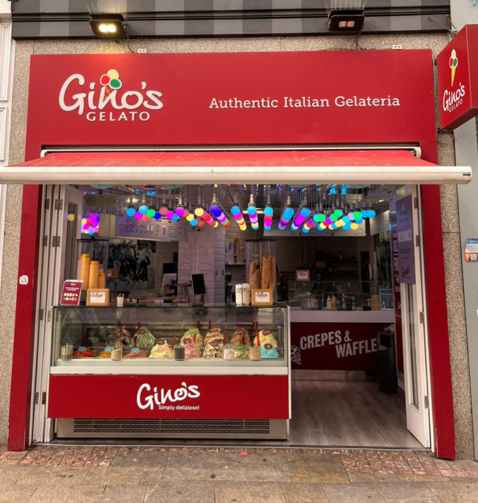
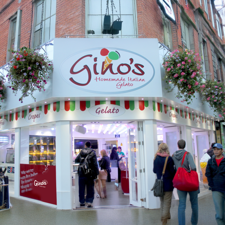
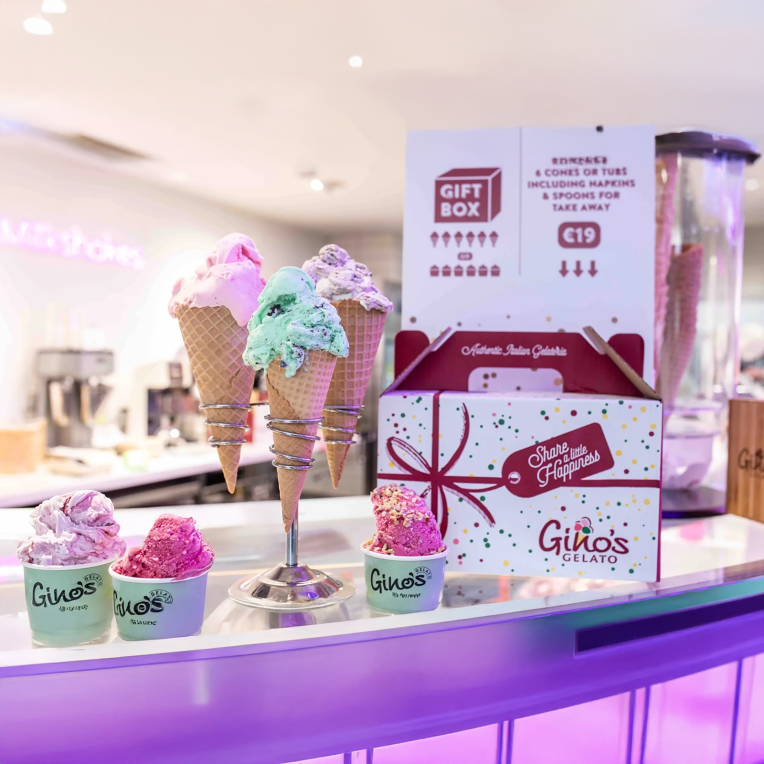
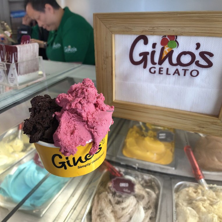
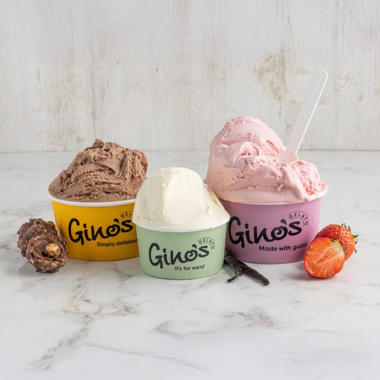
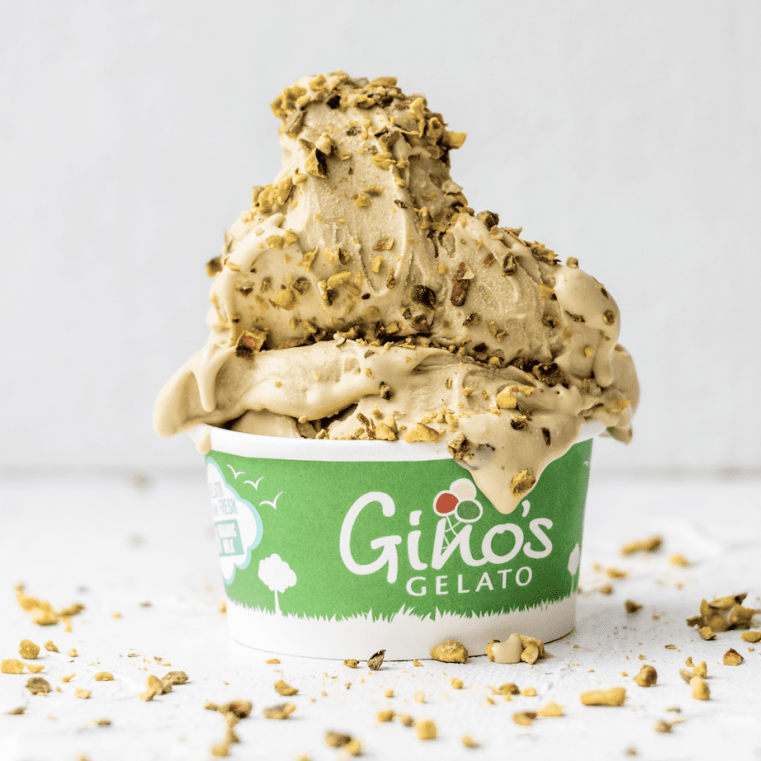
Gino’s Gelato
To create a robust visual identity for Ginos Gelato—a brand that combines authentic Italian methods with the quality of Irish ingredients. The challenge was to develop a versatile logo and color palette that would reinforce a strong, consistent brand across all physical and digital channels, from packaging to online at ginosgelato.com.


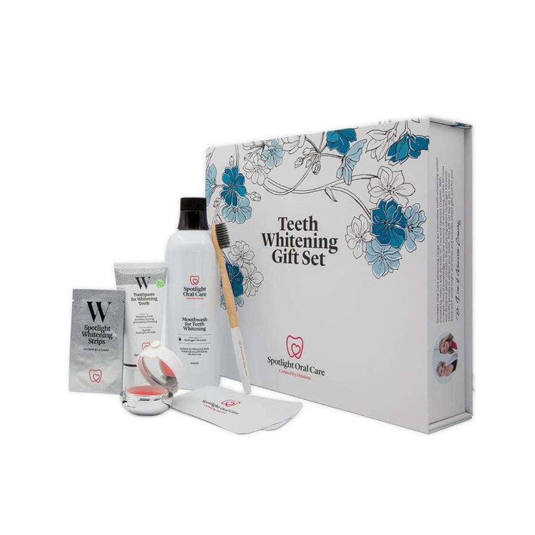
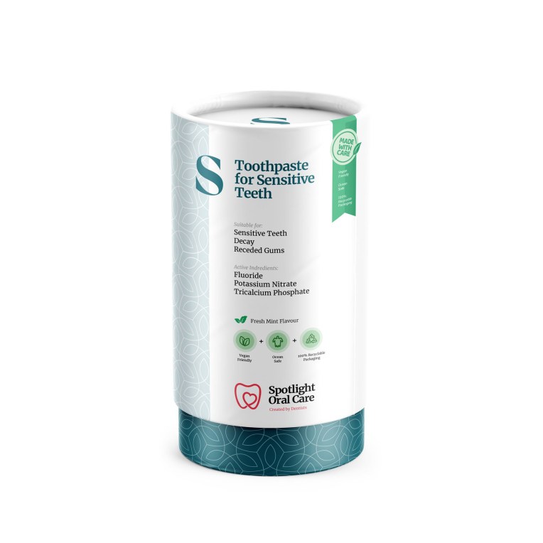
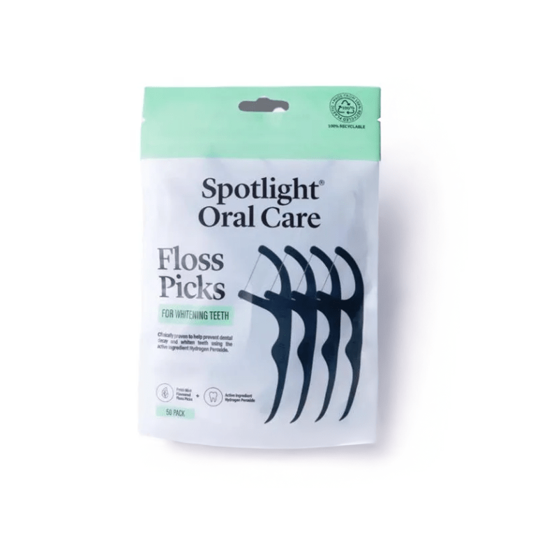
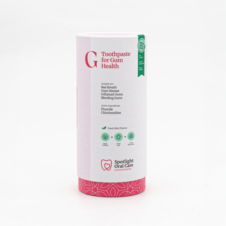
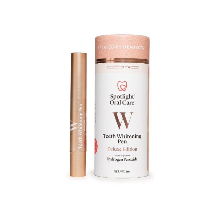
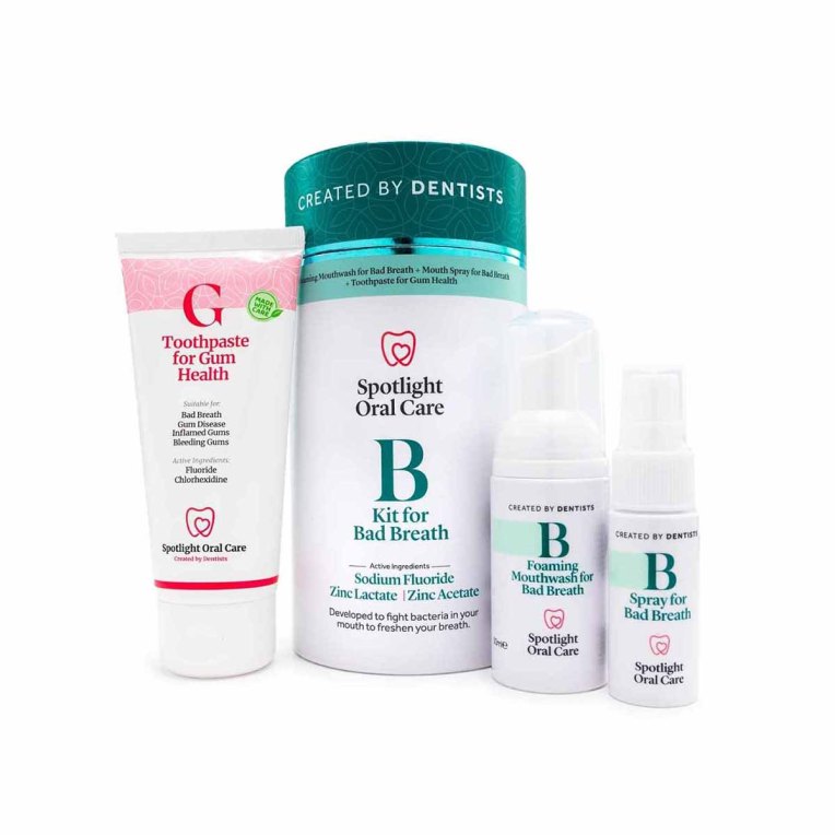
Spotlight Oral Health
To launch Spotlight’s new range of healthier toothpastes, we developed a clean and minimalist visual identity. The core of the system is a clear color-coding strategy that differentiates each product while ensuring strong brand unity. This adaptable design provided standout shelf presence and was rolled out consistently across all packaging, in-store displays, and marketing communications, positioning Spotlight as a modern and trusted leader in harm-free oral care.


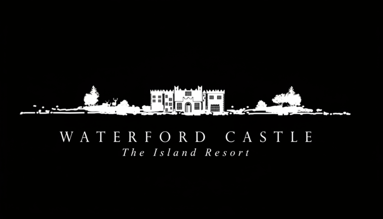
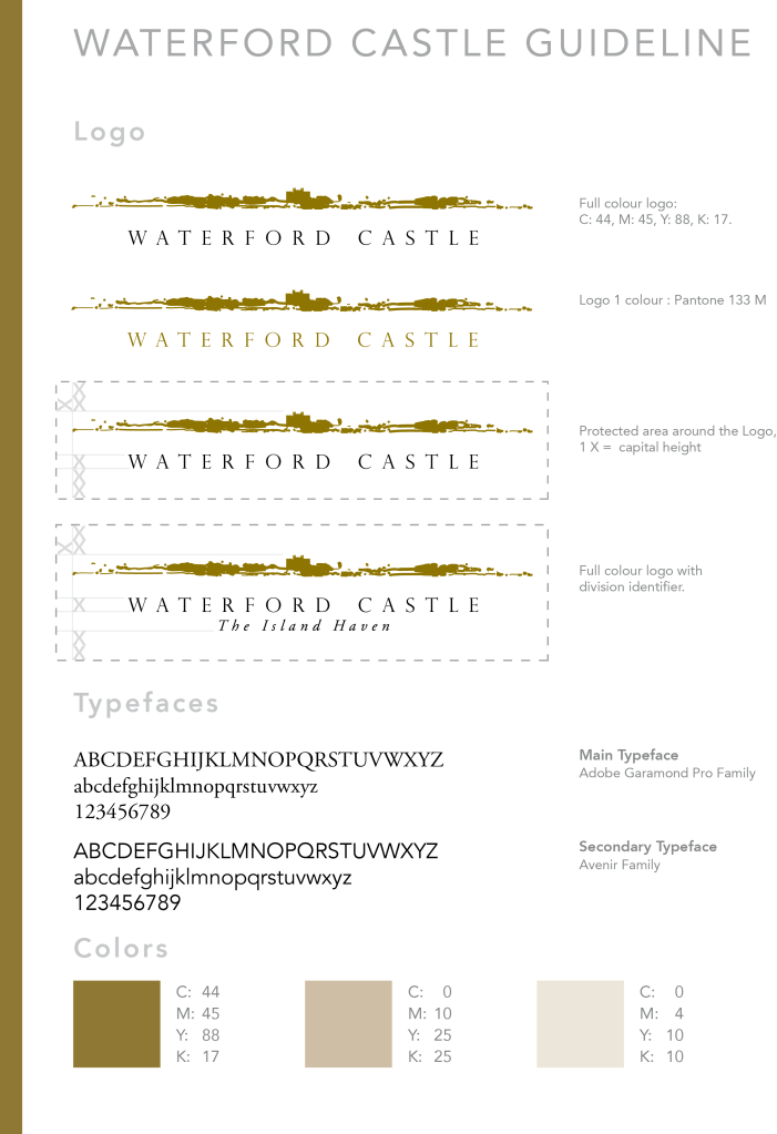
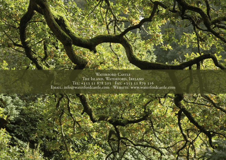
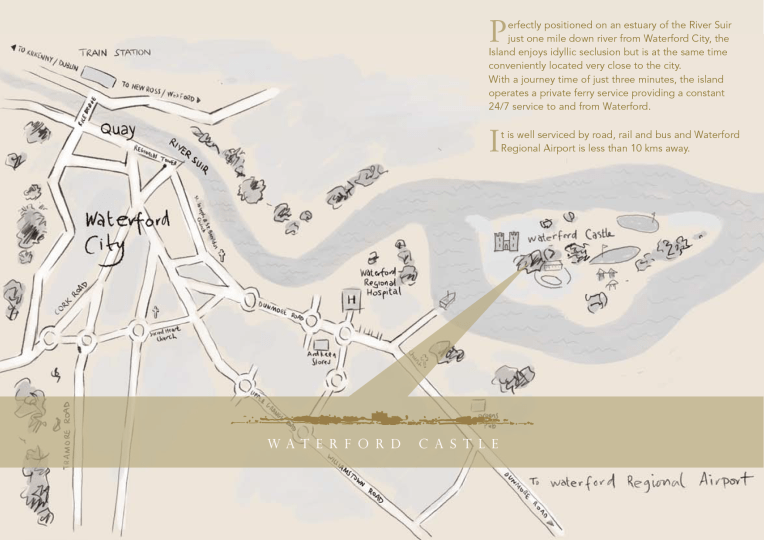
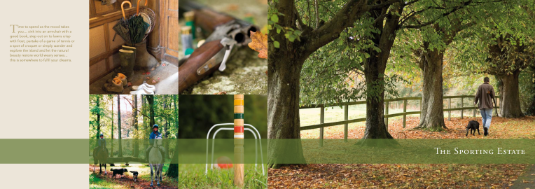
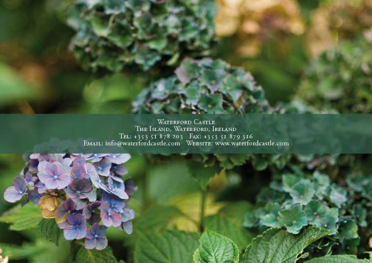
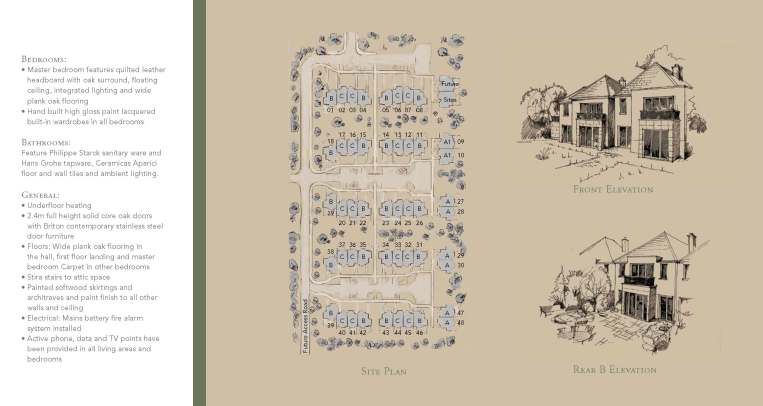
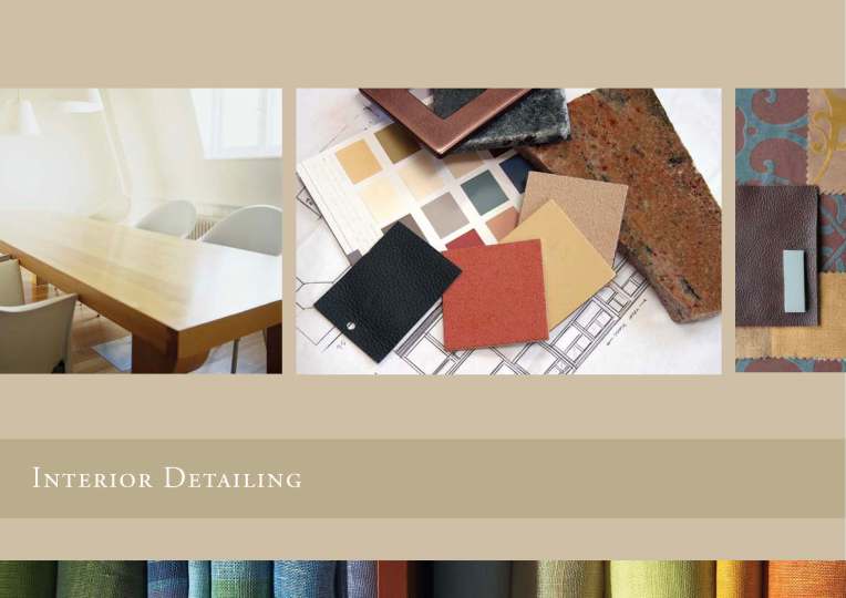
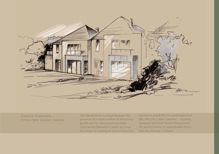
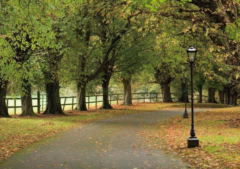
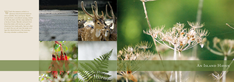
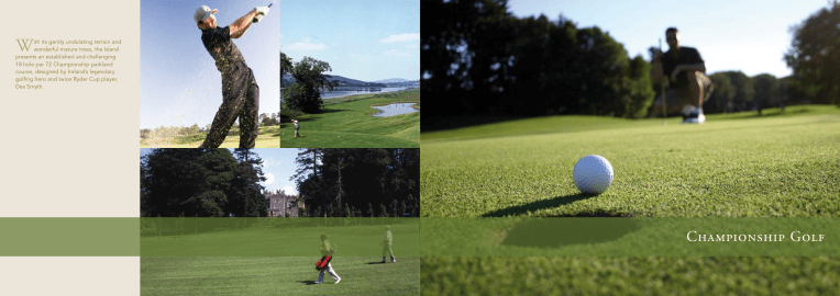
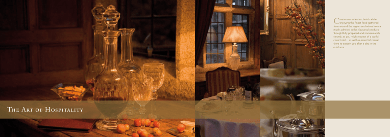
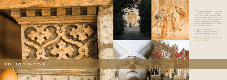
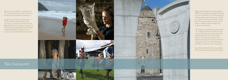
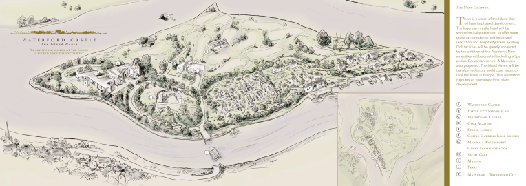
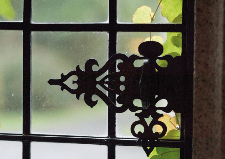
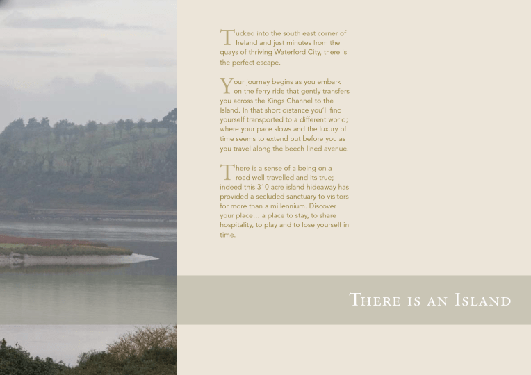
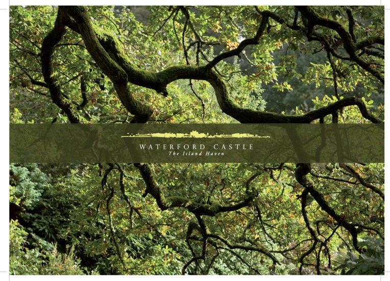
Waterford Castle, Hotel & Golf
To position Waterford Castle as a premier private island retreat, we created a brand identity steeped in heritage and natural elegance. This established a cohesive visual language, from the noble-inspired logo to a sophisticated brochure where stunning photography takes center stage, promising guests a timeless escape of understated luxury.


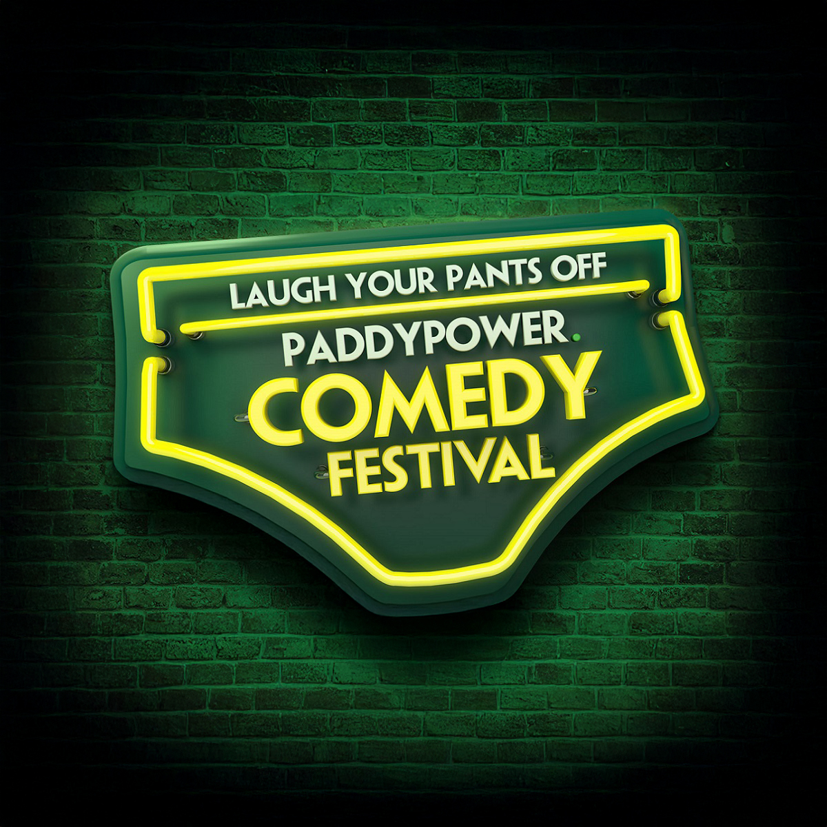
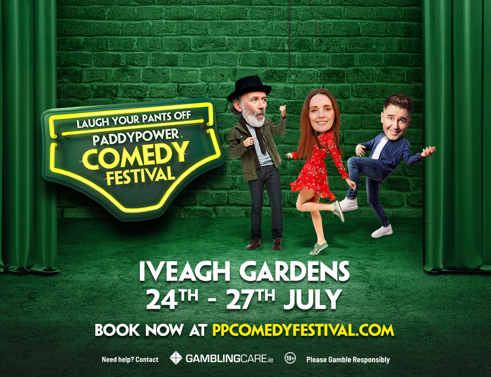
PADDY Power – Laugh Your Pants off
The Ivy Gardens Comedy Festival elevates Dublin’s iconic, dry-wit pub humor to a grand outdoor stage. Curated for a discerning audience, the branding needed to match this sharp, sophisticated ethos. Our central visual device—a clever pair of underpants in the logo—plays directly on the “Laugh Your Pants Off” promise, creating a bold and memorable emblem. This audacious mark is fused with a refined, contemporary design system, framing the festival as the ultimate cultural collision where underground authenticity meets world-class production.


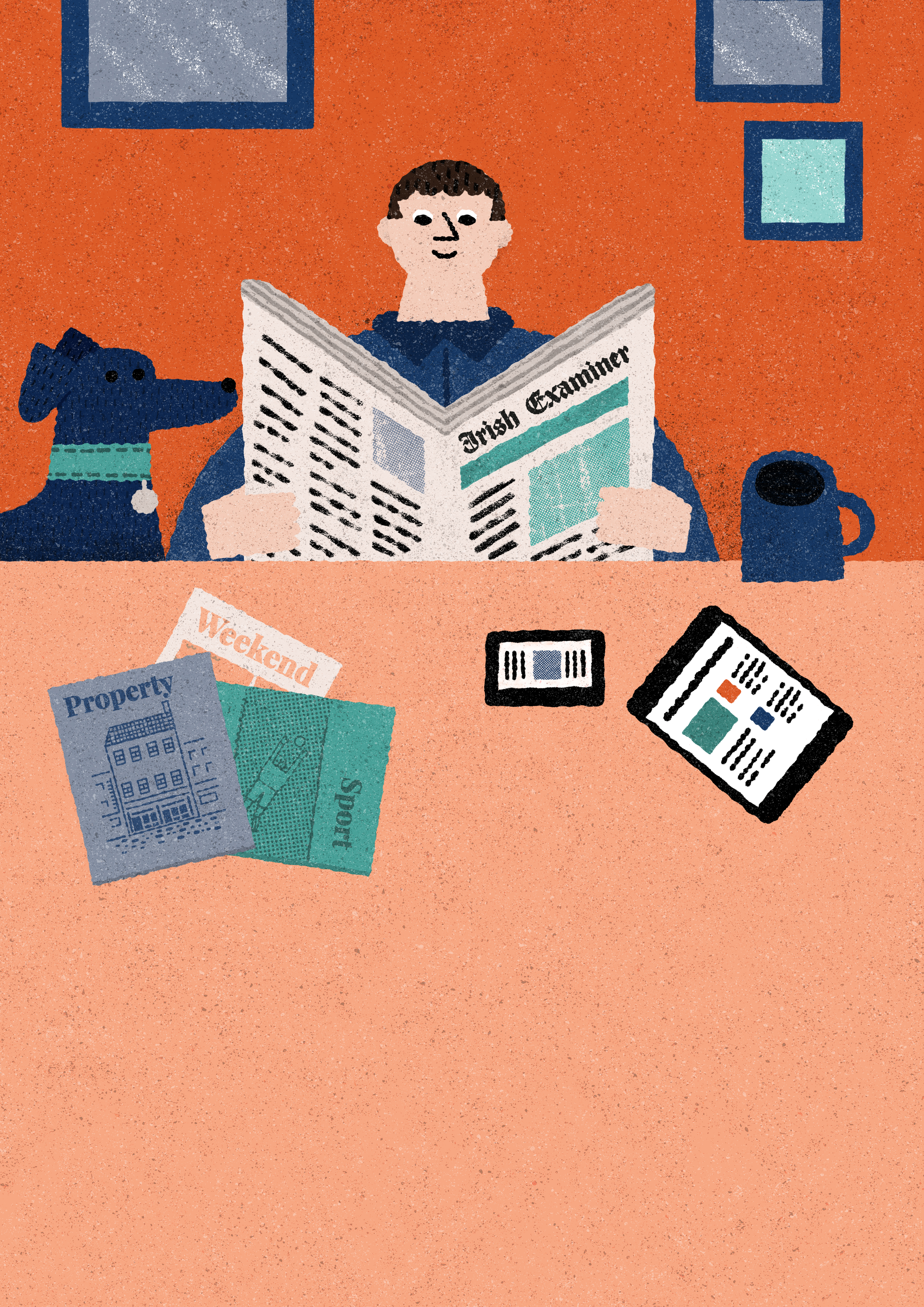
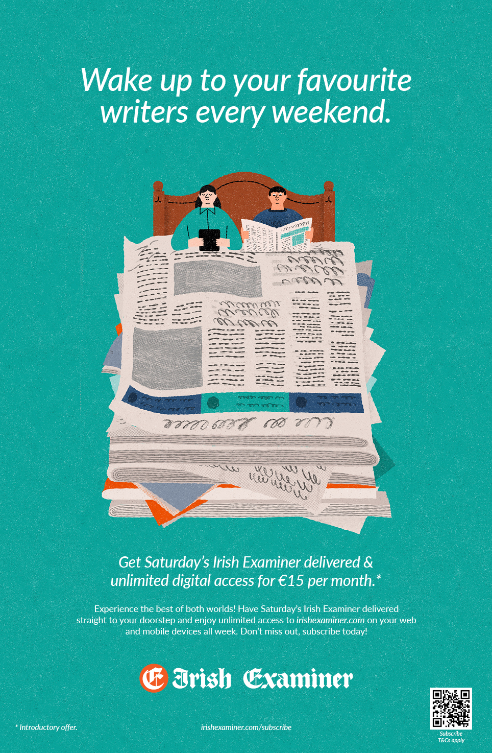
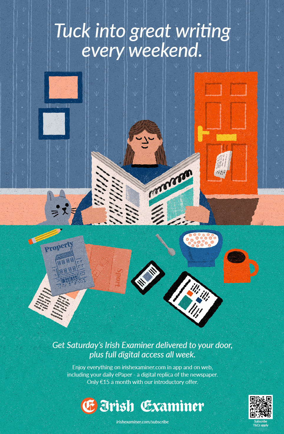
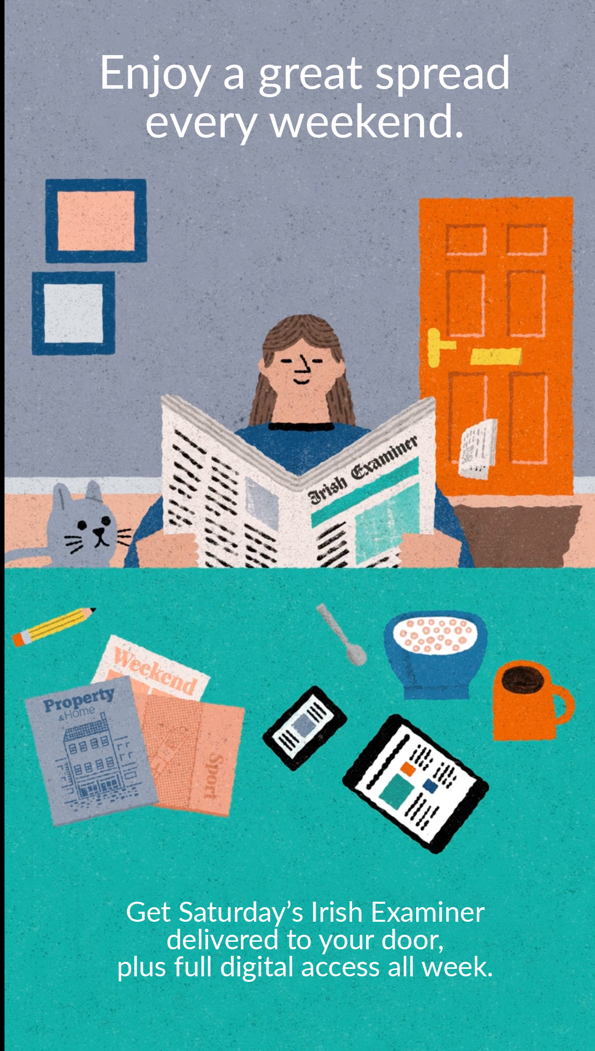
Irish Examiner Bundles
We developed a campaign to transition the Irish Examiner’s print audience to its new digital and hybrid subscriptions. To clearly communicate each package’s value, illustrator Conor Nolan created a distinctive style of artwork showing readers relaxed at home, engaging with the paper in different formats. These intuitive illustrations—deployed across ads, landing pages, and banners—provided an immediate, at-a-glance understanding of the options, simplifying the choice for subscribers and driving sign-ups.

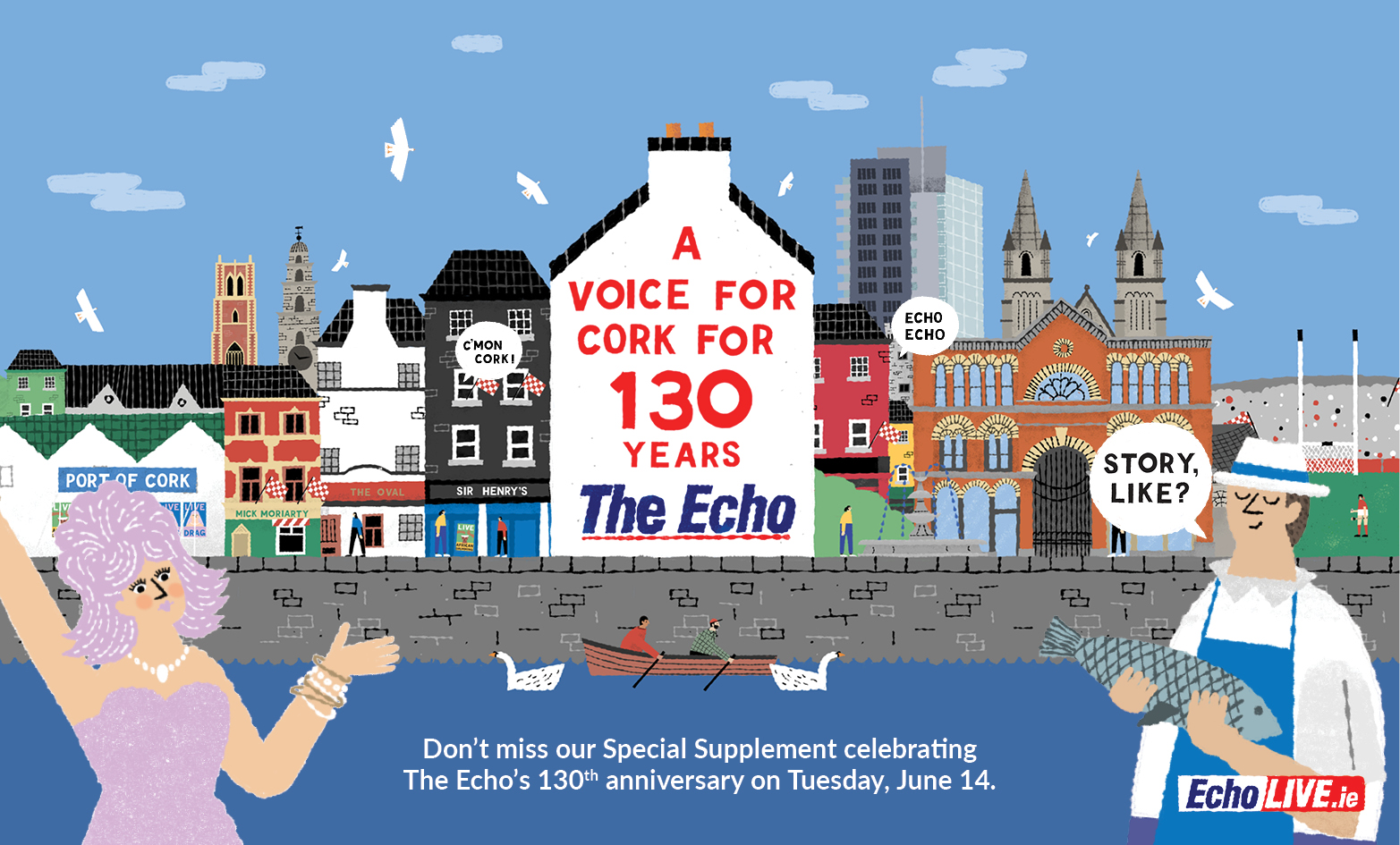
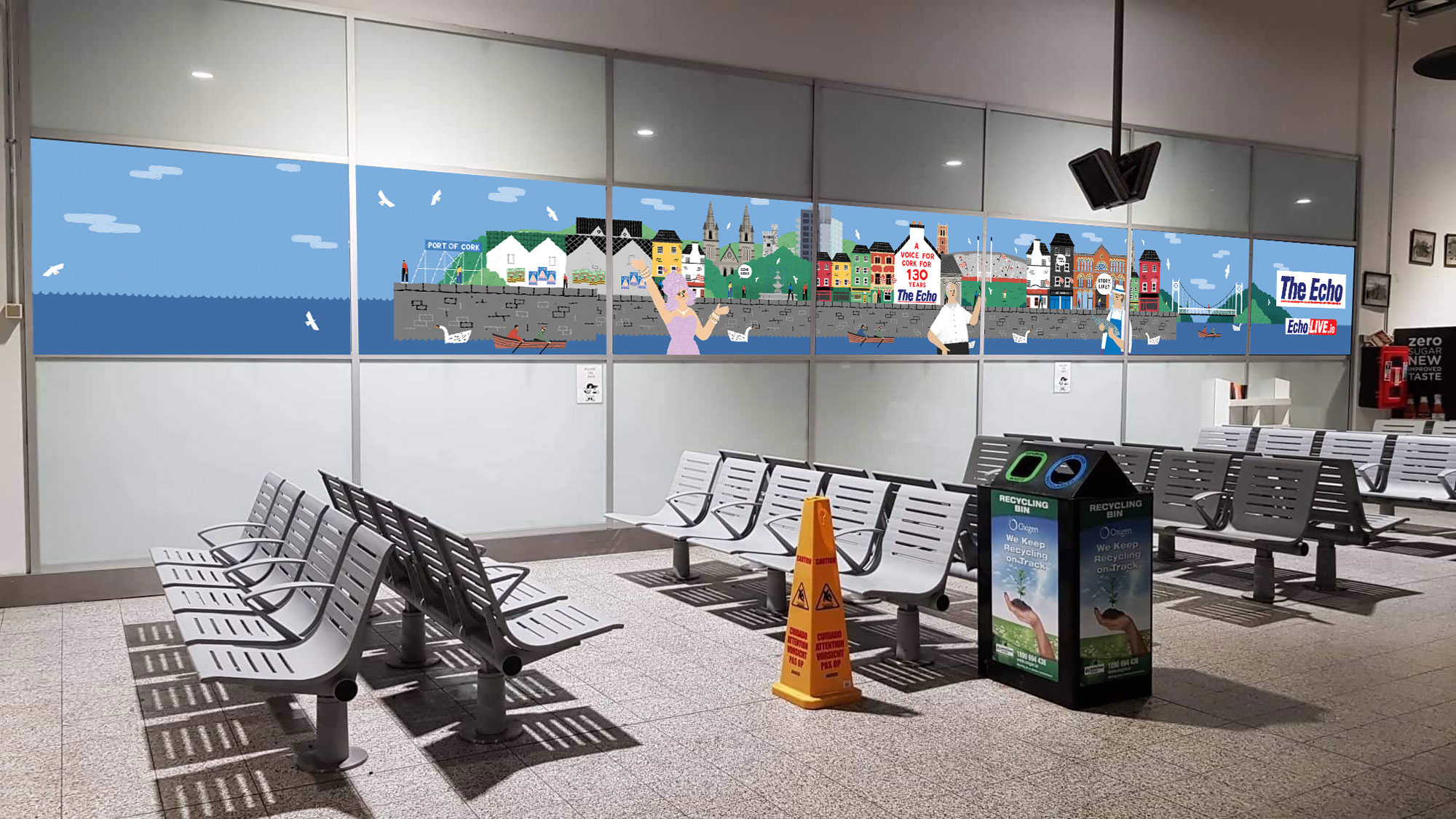
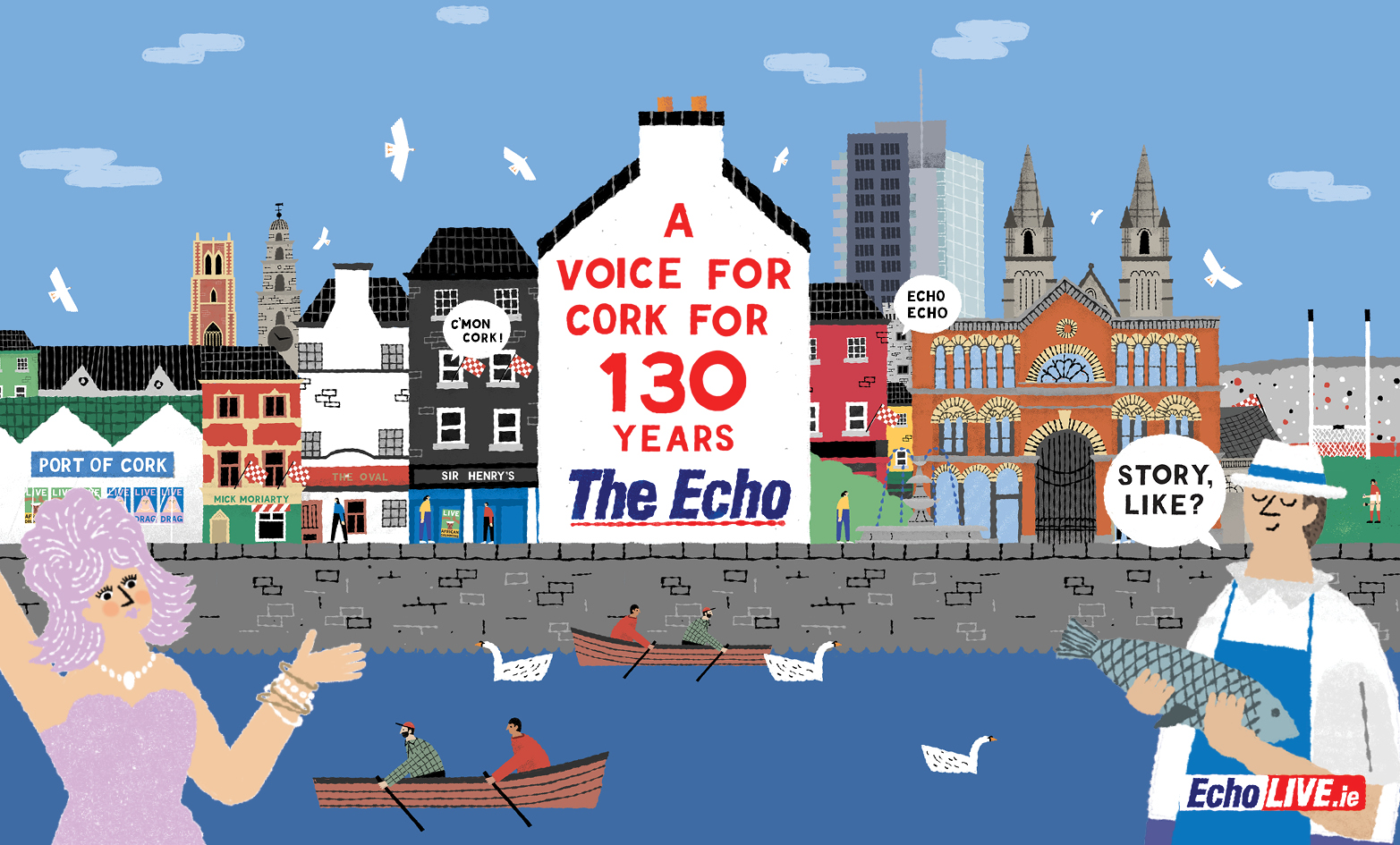
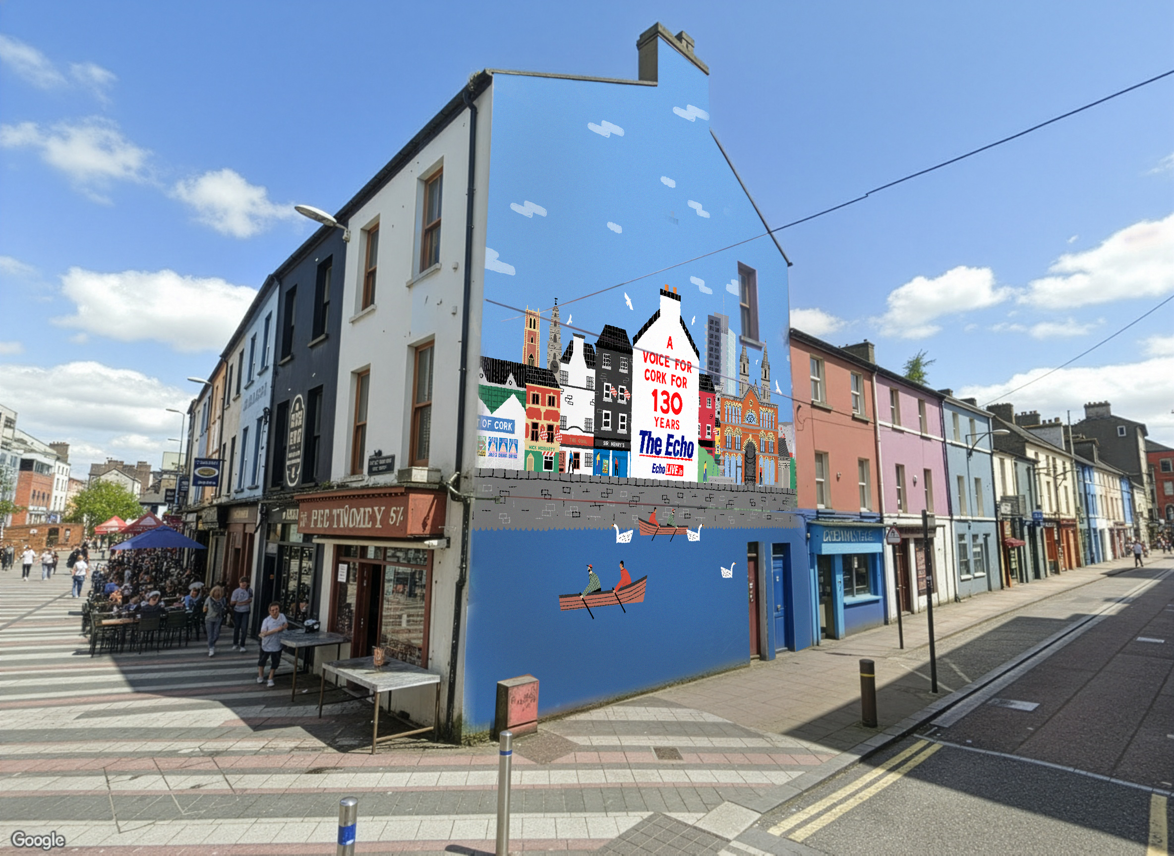
The Echo – A voice for 130 years
To celebrate a major anniversary for Cork’s beloved Evening Echo, we created a campaign that honored its deep local roots. Featuring distinctive artwork by Conor Nolan, the campaign leveraged authentic Cork identity across outdoor posters, print ads, and a prominent city-centre mural—publicly reinforcing the paper’s status as a community pillar.


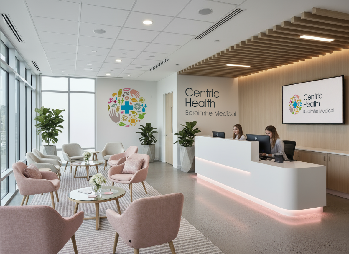
Broimhe Medical Center
The launch of a comprehensive medical centre in Swords presented a clear design brief: to develop a singular, elegant brand mark capable of communicating the integrated nature of its diverse services. This central symbol became the anchor for a full visual identity, applied across signage, digital platforms, and wayfinding to create a seamless and reassuring patient experience.


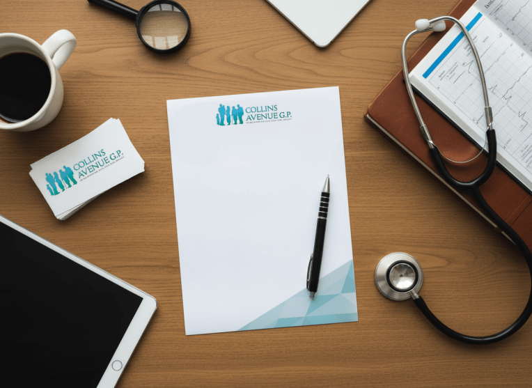
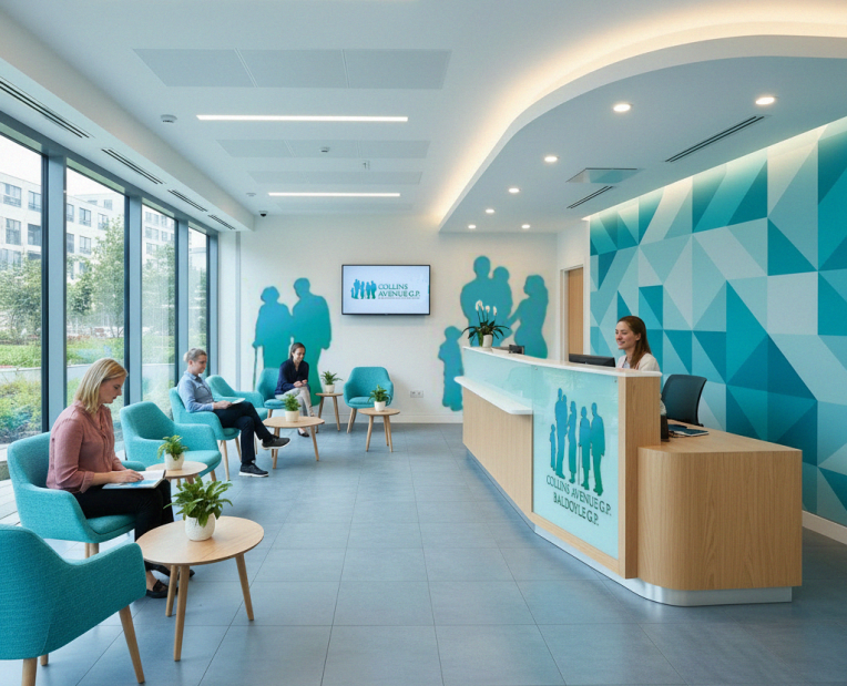
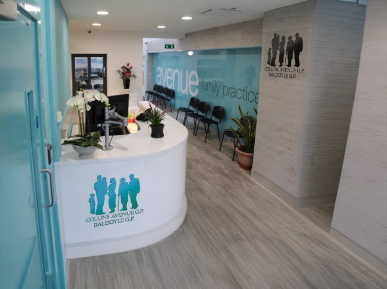
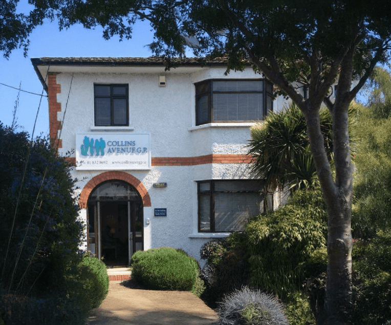
Collins Avenue GP Clinic ‘The Avenue’
This trusted practice, with two clinics in North Dublin, required a logo update for its new premises and materials. The challenge was to create a modern design that still honoured its long-standing heritage and identity as a traditional, family doctor trusted by generations. The solution was a refreshed emblem, a classic contemporary, abstract symbol representing family care and continuity.
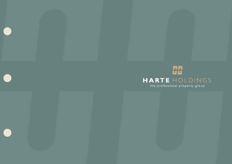
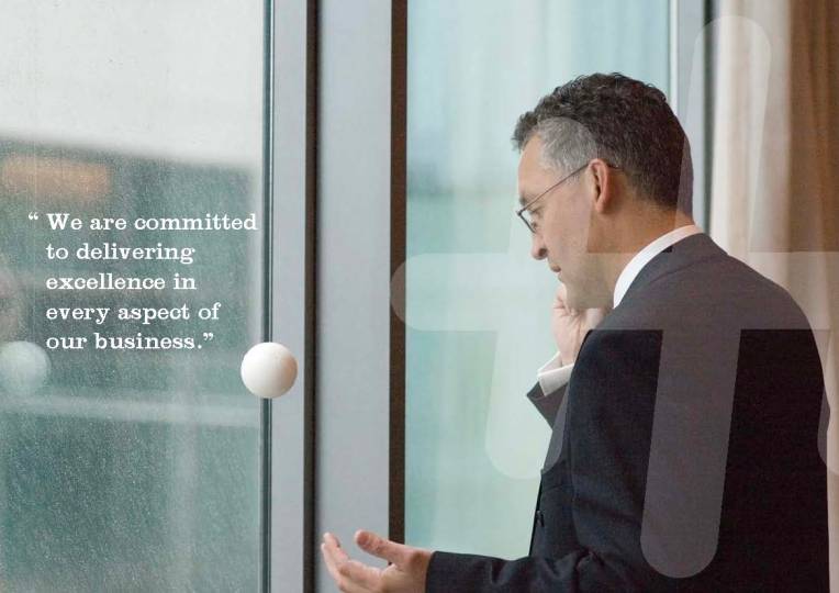
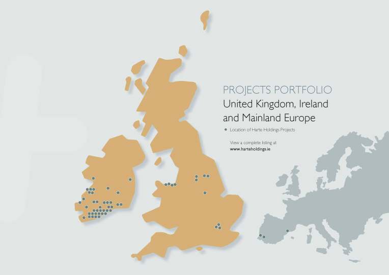
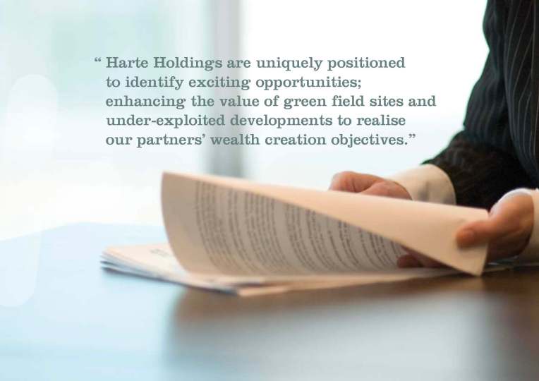
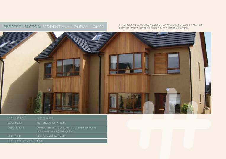
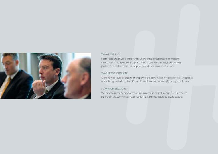
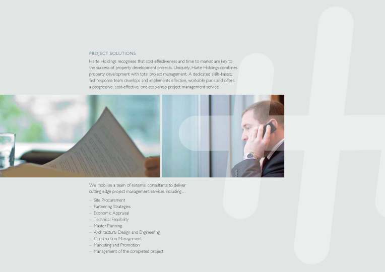
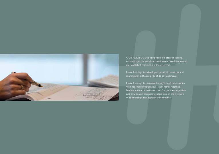
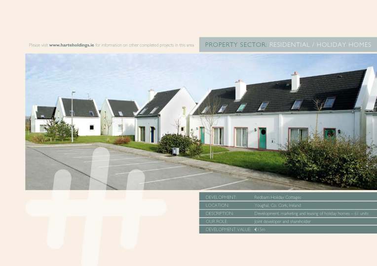
Harte Holdings
The client requested a small brochure to clearly outline Harte Holdings’ services and projects. The brief called for a design that was modern, clear, and reflective of a contemporary Irish business. The resulting brochure delivers this through a confident tone, a refined Celtic colour palette, and dynamic contemporary reportage photography, together creating a professional and distinctly authentic presentation of the company’s scope and expertise.


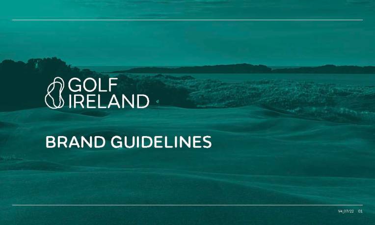
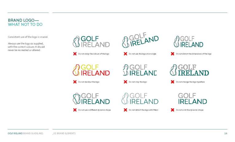
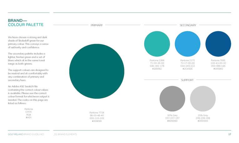
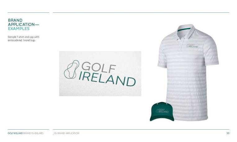
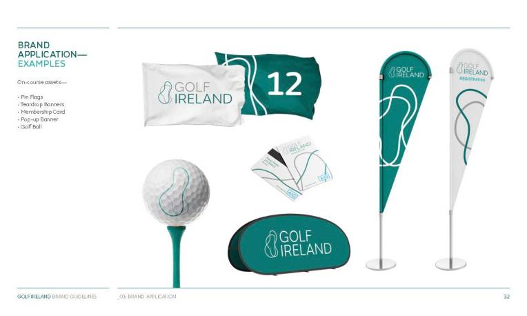
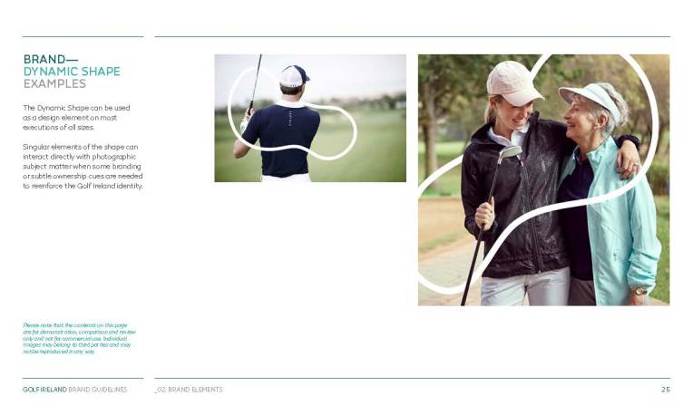
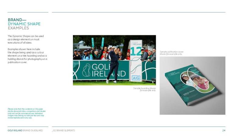
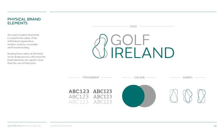
Golf Ireland
This identity was designed to give visual form to Golf Ireland’s purpose: to be a modern, inclusive, and cohesive governing body. The central dynamic shape—symbolising two greens uniting—visually communicates the core principle that “we are stronger together.” This cohesive system, reflecting values of accessibility and progress, was rolled out as a unified brand language across all touchpoints, including the website, app, tournament merchandise, and event signage.


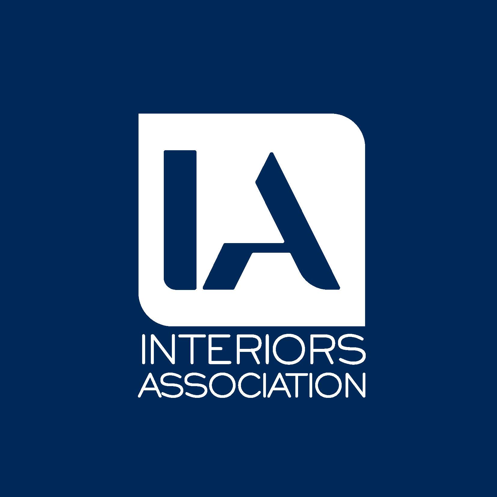
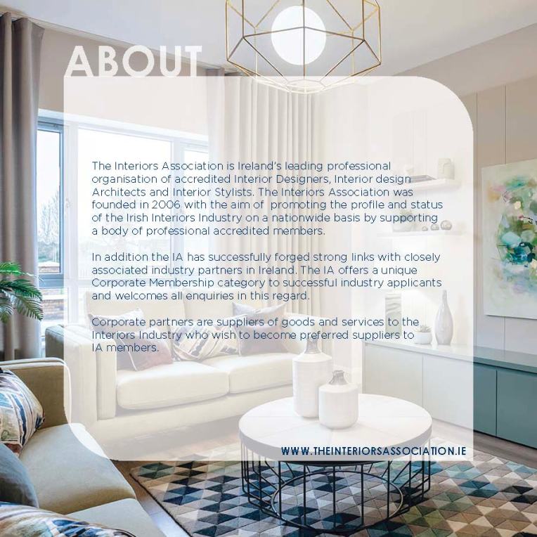
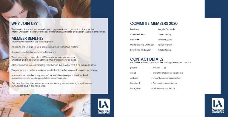
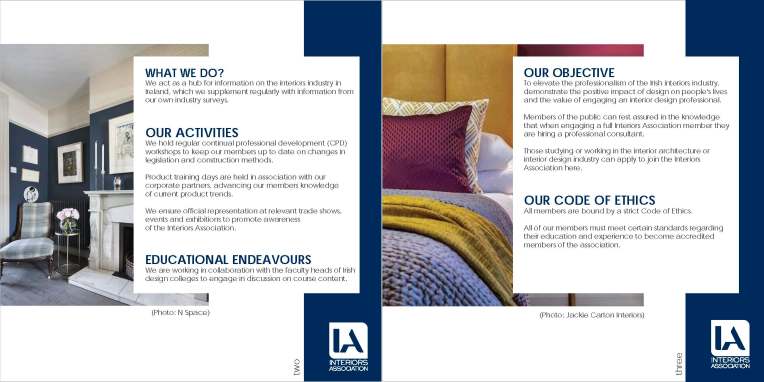
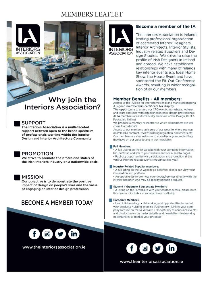
interiors association
We created a client facing brochure for the Interiors Association, outlining the services Interiors Association offer. The design of the brochure was a reflection of their logo and was applied as a template graphic on all the pages. This helped with consistency and synergy throughout all design assets.


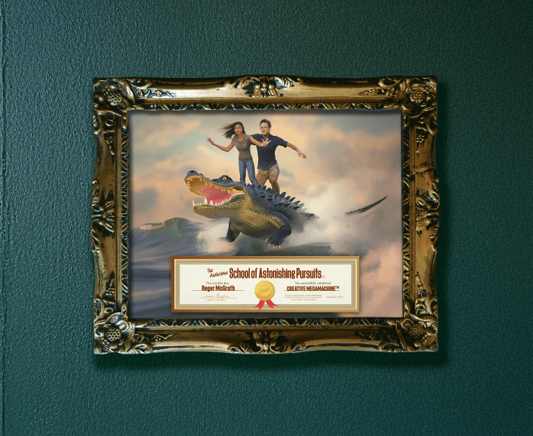
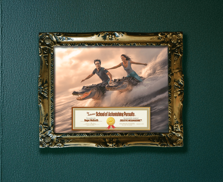
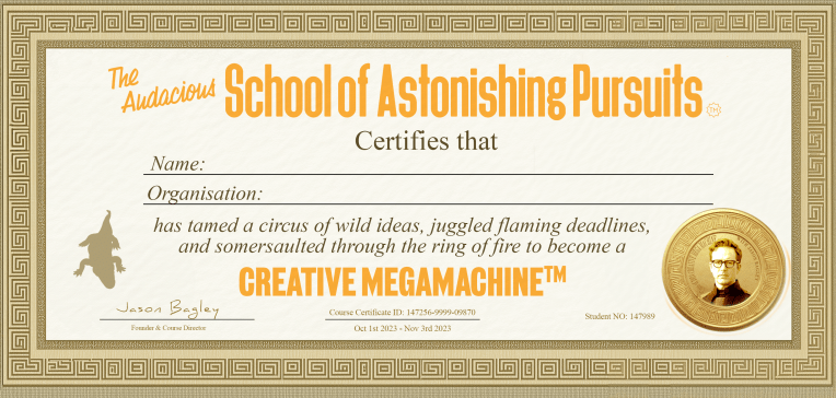
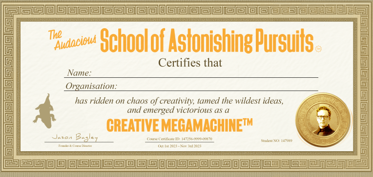
School of astonishing pursuits
At the School of Astonishing Pursuits, creatives learn to apply former Wieden+Kennedy CCO Jason Bagley’s “7 CD Secrets” to sell and produce world-class work in under 60 days. As a tutor, Jason challenged us to design a certificate for the Creative Megamachine course with one directive: “Just go mad.” The resulting image—featuring Jason surfing on the back of a crocodile alongside a graduate—captures the wildly imaginative spirit he inspired.


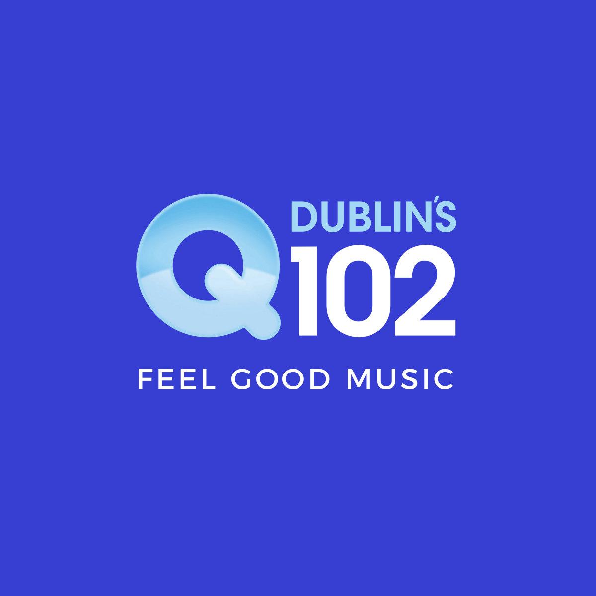
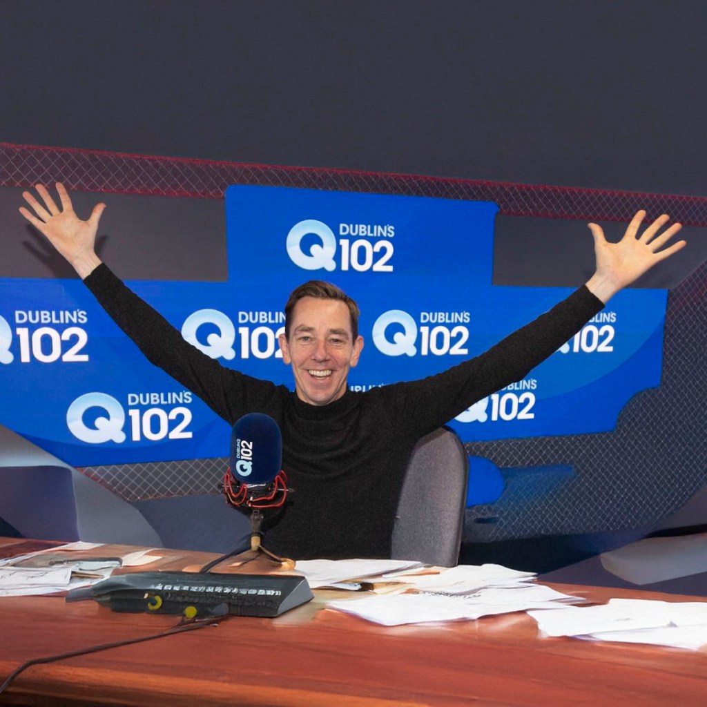
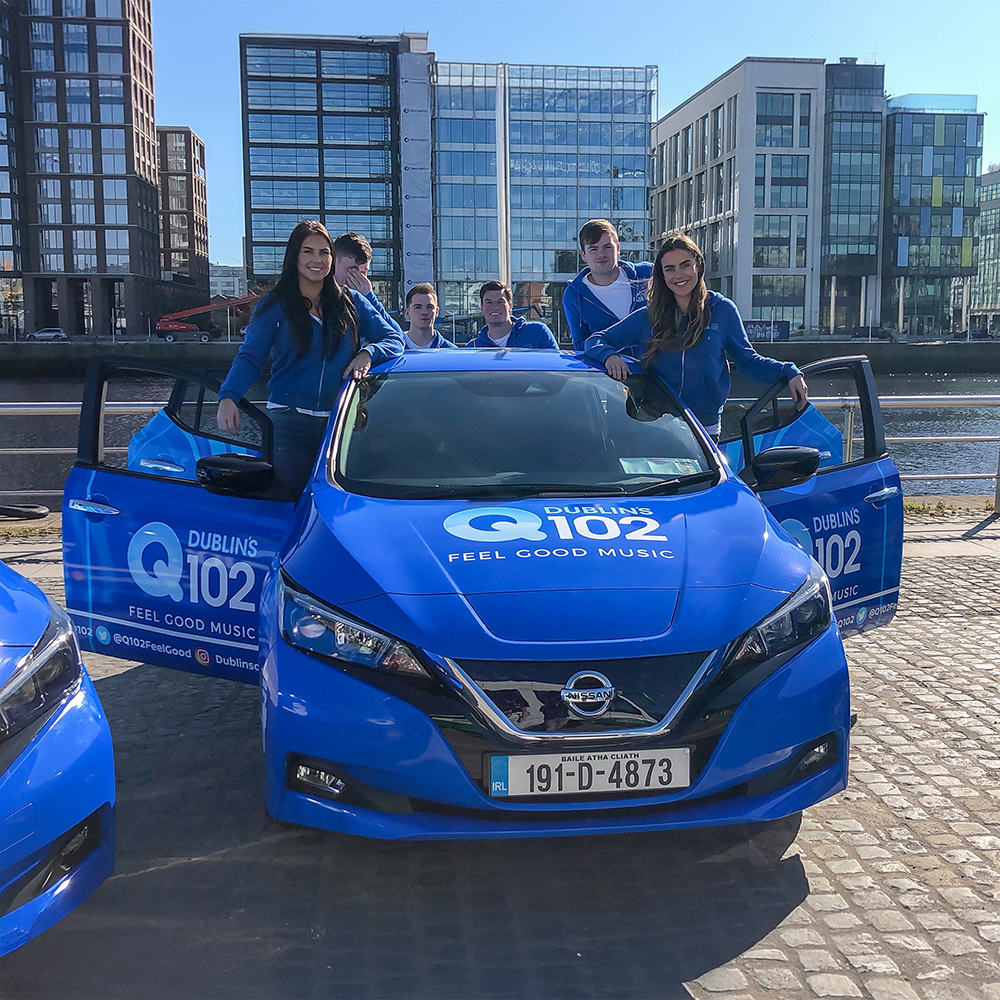
Q102 Radio
Q102 commissioned a visual refresh of their brand to modernize their presence. The key objective was to create a flexible logo and updated brand palette that would maintain impact and consistency across diverse applications—from vehicle livery and promotional merchandise to their mobile studio. A core part of the project was the strategic integration of their new strapline into the visual identity.
https://www.q102.ie/


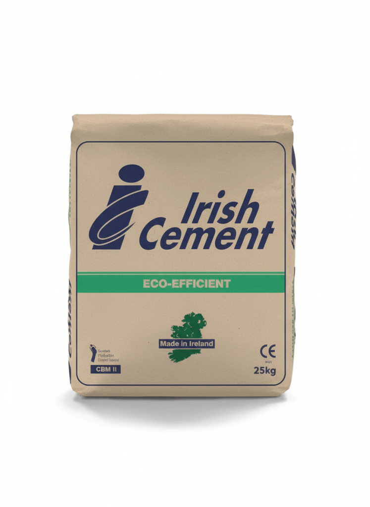
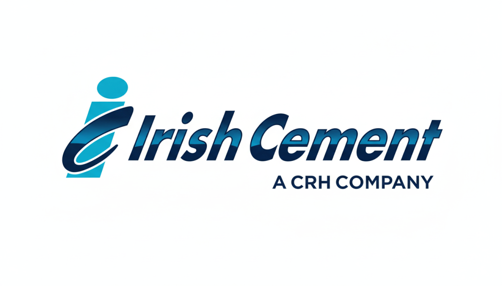
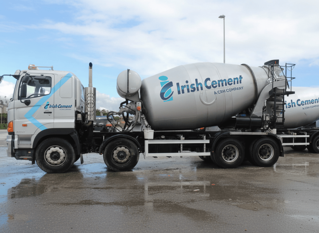
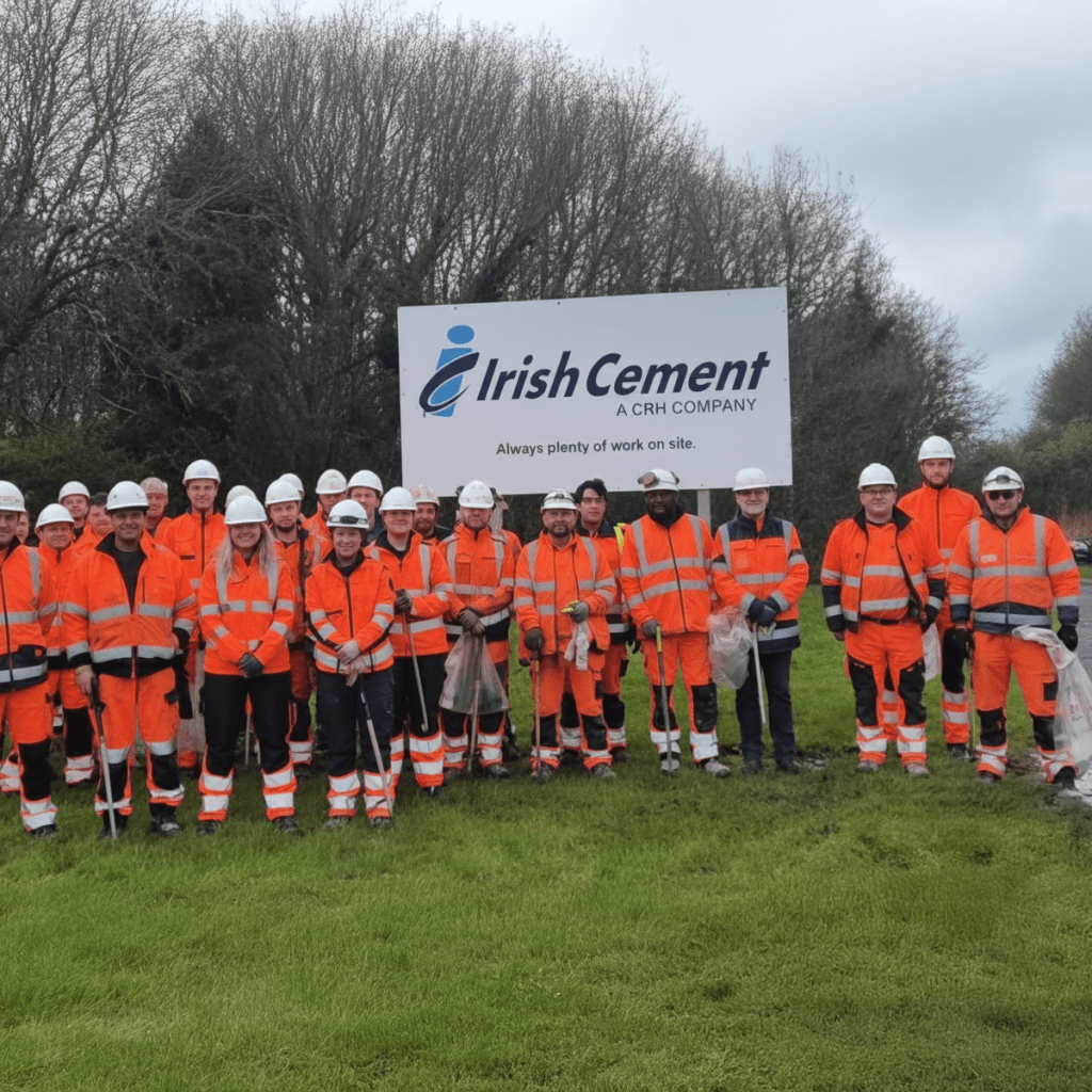
irish cement
As a long-established and trusted leader in the Irish construction industry, Irish Cement sought a brand evolution. The goal was to thoughtfully modernise their classic identity and implement a cohesive new system across their entire product and vehicle range.
Portmarnock Vet
Following its acquisition after 40 years of community service, the newly updated Portmarnock Veterinary Practice required a fresh identity. The new owners had modernised the premises and expanded services, and needed simple, charming branding to reflect the practice’s enduring friendly and caring nature.


AIB – Future Sorted
AIB engaged us to introduce branch visitors to their Future Sorted products, a suite designed to empower customers through pensions, long-term savings, investments, and life insurance. We created succinct, high-quality animations that complemented each product’s unique benefits. This campaign successfully aired across AIB’s entire branch network in Ireland, effectively raising awareness and consideration.
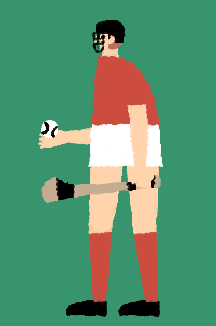
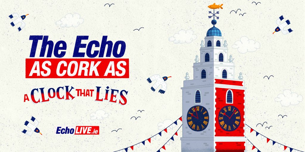
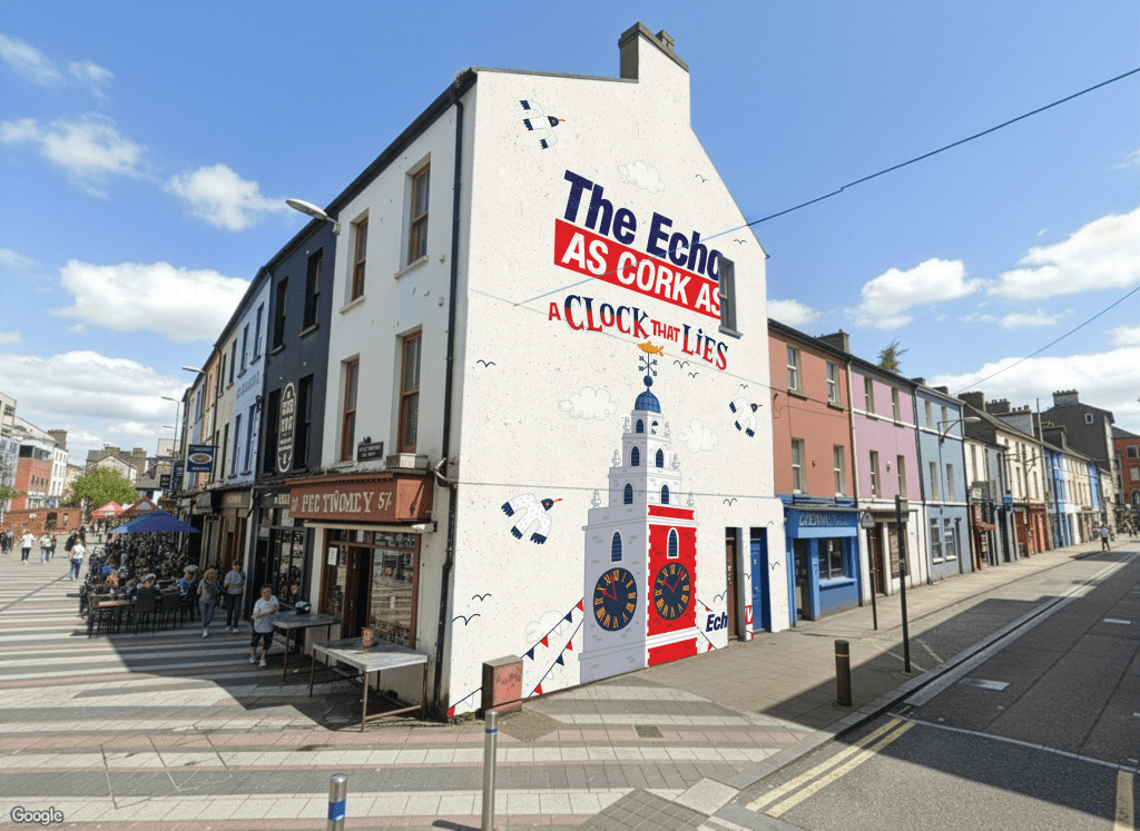
Cork Evening Echo
With readership falling, the Cork Evening Echo wanted to remind Corkonians that this is the paper that has all the local news and events. It’s written by local people and journalist and is part and parcel of Cork City Culture. The executions were designed and illustrated by Steve Simpson and ran in press, outdoor and as a feature mural on gable ends throughout the city centre of Cork.


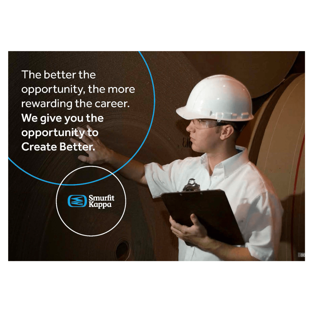
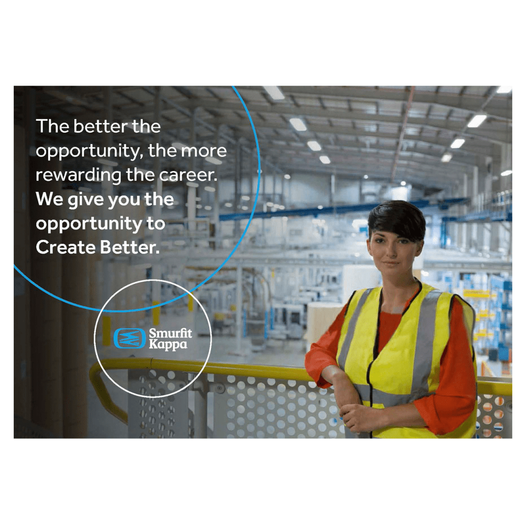
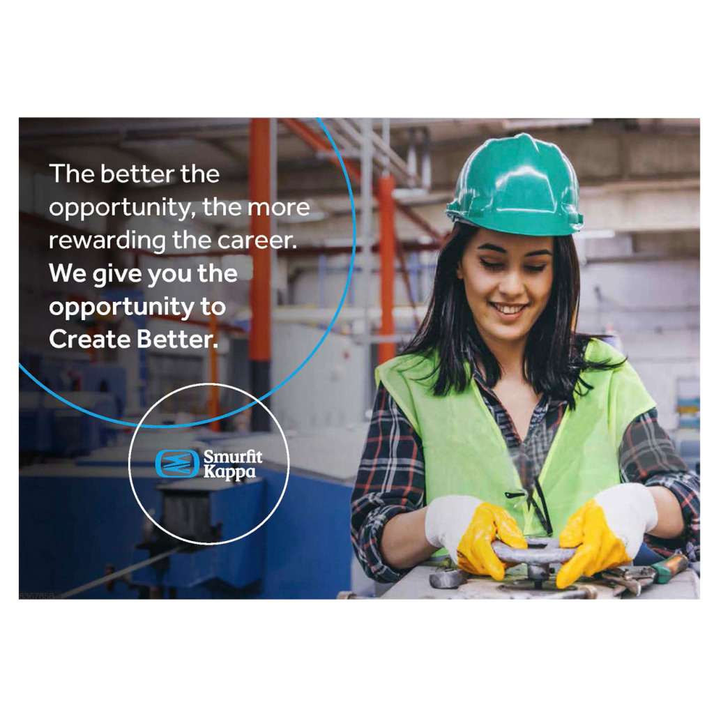
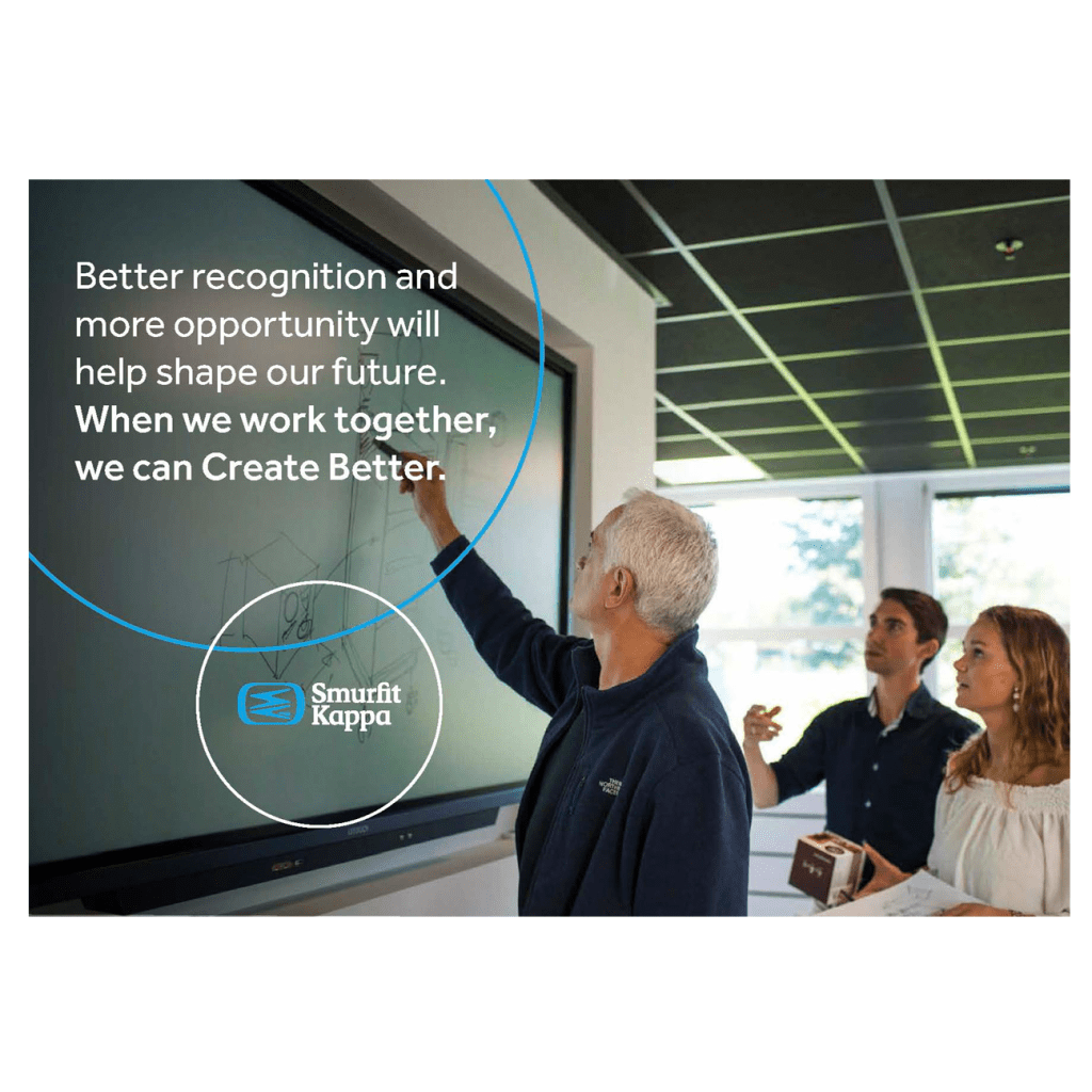
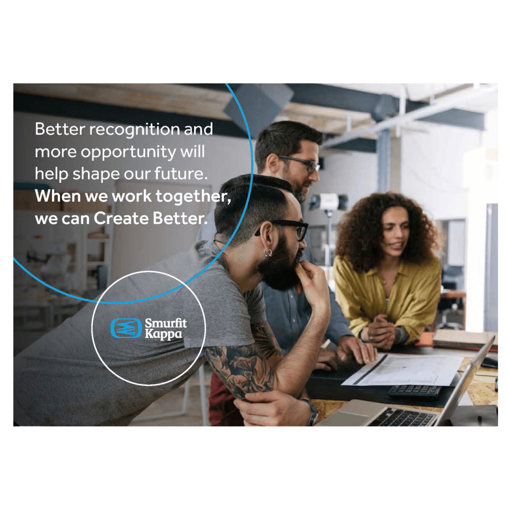
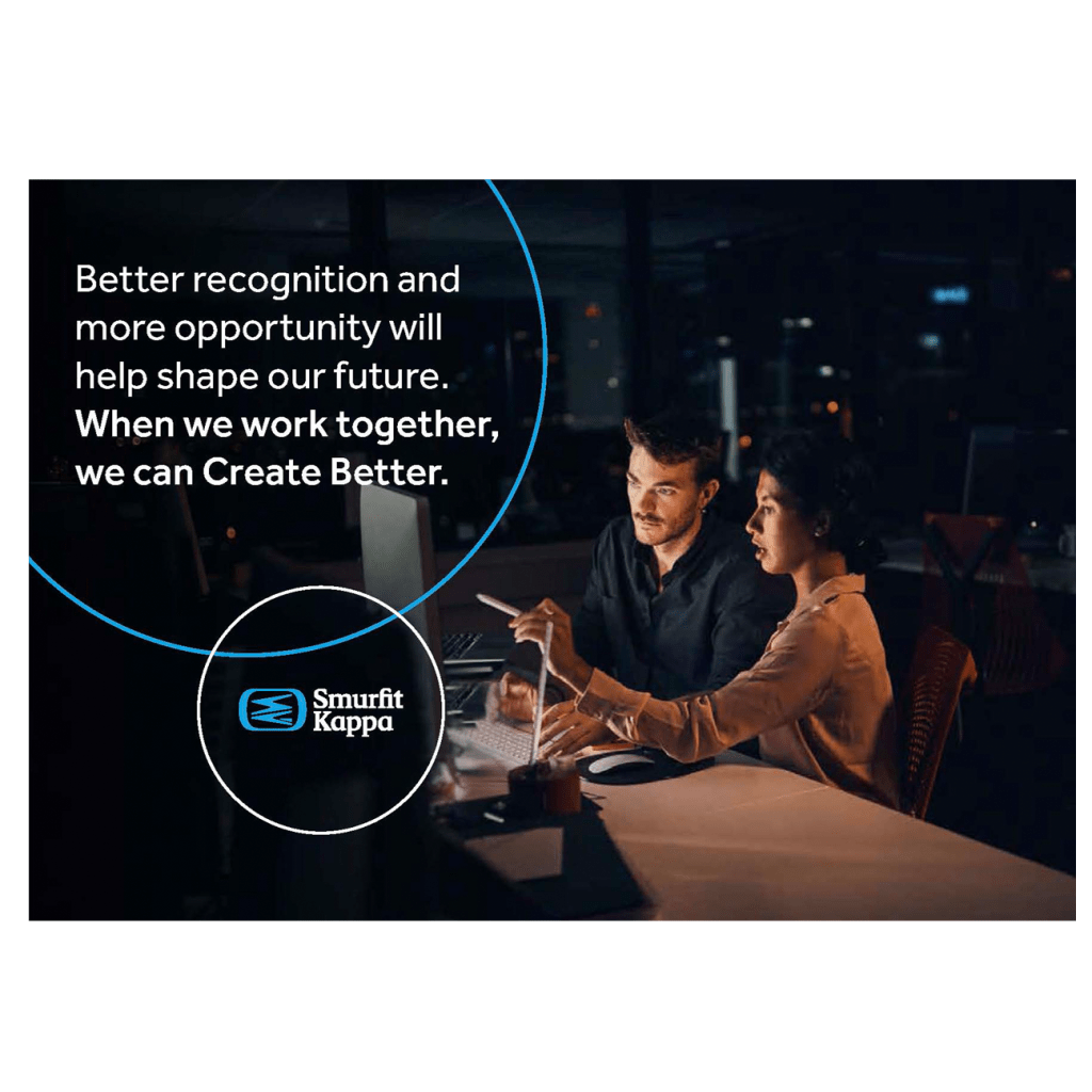
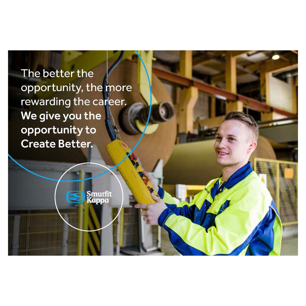
Smurfit Kappa recruitment
To attract the next generation of problem-solvers, Smurfit Kappa executed a dynamic recruitment campaign. This series of advertisements was crafted not only to outline critical in-demand skills but also to showcase the tangible impact of working within a genuinely innovative culture. The core message invited candidates to join a global leader where dynamic work directly advances the worldwide movement toward a circular economy.